Picking Interior Paint Colors
Picking Interior Paint Colors
One of the most frustrating parts about picking paint colors is trying to use a 2″x2″ (or smaller) paint chip to pick your colors from. They never match and you might be ready to boil over in anger. Trying to find the right color might have you shouting
WHY CAN’T IT JUST LOOK LIKE THE CHIP!
Trust me, I get the frustration. I just recently expanded our service area to help people that are looking for an El Dorado Hills interior painter, but I’ve been dealing with these tiny paint chips for over 20 years, and I still get frustrated at times. Thankfully I have a few tips that might help you out with the process.
Tip Number One – Mind The Lights
Light bulbs come in 3 primary tones and actually have a bigger impact on colors than you might think. Each of these three levels has a range of light, but we’ll stick with three to make things easy.
- Soft White is a soft yellow/orange light. It creates a smooth and relaxed atmosphere and is on the warm end of the color spectrum. Best for paint colors that have red, yellow and green in their base. Will have a negative impact on neutral colors that have teal, blue or violet/purple undertones so avoid those.
- Cool White is the middle of the spectrum. It will typically lean slightly warm or cool depending on the exact model you buy, but will give the best overall feel to neutral colors. Typically it will just make colors look lighter than they actually are.
- Daylight is on the cool end of the color spectrum and will usually have a blueish look to the light. It is supposed to resemble outside light in the middle of a day with no clouds, but I think it’s too blue. Best for paint colors with teal, blue and violet or purple in their base. Will have a negative impact on neutral colors that have red, yellow or green undertones.
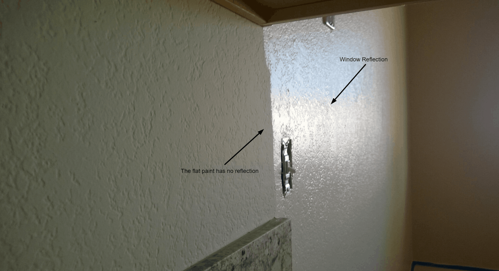
Tip Number Two – Mind The Sheen
Paint comes in an array of sheen’s. Again, to keep it simple we will be sticking to the 3 most common sheen’s. In general, the shinier the paint is the lighter it will look, and the more the color will be altered by your lighting and furniture.
- Flat paint is the closest you can get to no sheen at all. Most of the time you can’t see any with your eyes and you have to use special equipment to tell if it has any. We try to use it only on ceilings because it can’t really be washed. It tends to be a little darker than the paint chips, but is rarely noticeable. It also doesn’t reflect a lot of light so it can do a good job at offsetting poor lighting choices.
- Eggshell paint is the our go to wall paint. You can clean stuff off of it pretty well and it has a slight sheen which gives it a richer look. The shine shouldn’t be overpowering but since it does reflect some light it can really amplify any light colors or furniture that may muddy up the paint color you chose. It will typically be a little lighter than the paint chips because of the way it reflects and absorbs light.
- Semi-Gloss paint is typically reserved for trim, doors, cabinets, etc. It is the most durable, and occasionally we will use it in kitchens and bathrooms, but eggshell is plenty durable for those rooms unless you want them to be shiny. Because of how shiny it is, it will see the greatest impact from the color of the lights you choose. Will be noticeably lighter than the paint chips – sometimes as much as 2 or 3 shade!
Tip Number Three – Mind The Tint Colors
- Warm Colors will typically have red, yellow or green in their tint formula and most Tan shades tend to fall into this classification.
- Cool Colors will typically have teal, blue, purple or violet in their tint formula and most Gray shades tend to fall into this classification.
A color won’t usually have all of these in their tint formula, but if you want a Tan that is on the cooler side you can look for one that has teal or blue and that will give it a cooler feel.
On the flip side, if you want a gray, but it just looks too blue you can try looking for a gray with more purple/violet in it or just try adding some red to the color you like (I take no responsibility for you messing up your colors though).
The options are really only limited by your patience, and budget for sample quarts! Hopefully this has given you some clarity in searching for the perfect color for your home. If you’d like to talk about having us paint your home and helping you with color choices you can fill out our contact form below or give us a call right now at 209.256.4587!
And you can also contact us at our different website called Galt House Painter, our painting company in Galt, CA in where we provide high-quality painting with the best finish to everyone.
If there’s any way we can help you, or if you’d like us to answer your question in our next blog feel free to leave it in the comments!
")